One of the most beautiful things about hockey is the jerseys. There’s so much you can do. In other sports, the jerseys are pretty standardized; you usually have the team name, a number and the player name on the back and that’s it. But in hockey, people play for the crest. It’s typically the one major sport where the team crest is loud and proud in the center.
The NAIT Ooks hockey teams have an extensive jersey history, of course, going back to the 1960s and to rank the best of all of them isn’t easy, but I’ve decided to give it a go. Here are my top five Ooks hockey jerseys of all time.
5. 2008-14 Sabres-style jersey

Shout-out to the fan who was wearing this jersey at home games when Josh Lazowski returned this season. Looking back at this jersey, it’s reminiscent of the “Buffaslug” jersey belonging to the Buffalo Sabres. But in my opinion, the Ooks actually did it better. The body is a bit plain, but the sleeves and font are amazing. And I think the Ooks logo works better than the Buffaslug. The 2000’s Ooks logo looks a bit dated on this jersey, so my preference goes to the early-2010’s Ooks logo.
4. 1975-78 “Ookpik” jersey
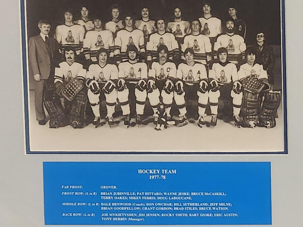
This jersey looks so fantastic. Simple, with the full-gear Ook as the crest. This reminds me of the 2022-23 Vancouver Canucks reverse retro jersey, and I am absolutely here for it. Lovely logo, vintage font and beautiful threads. The striping isn’t standout, but even just regular striping complements nicely.
3. Late-2010’s Ooks logo away jersey

There’s something about having the Ooks logo grace the front of the jersey that’s cooler than the varsity “N” or the NAIT wordmark. The modern Ooks logo is arguably one of the cleanest. It gives off Winnipeg Jets vibes with the stripe layout and font. These jerseys scream “we came to play and win.” Plus that neon yellow blends really well with the white base.
2. 2010’s two-tone varsity “N” jersey
If done right, two-tone jerseys can work really well, and this one definitely does. The jersey has a dark primary colour, with bright yellow accents and a nice three-layer striping scheme at the base. Laces below the collar give it that extra-classic touch, and no standout shoulder yokes or patches. It’s a four-C’s jersey: crisp, clean, classic, and (very) cool.
1. 1984-92 royal-blue NAIT logo jersey
No matter whether you favour nostalgia, creative logos, or simplicity this is the perfect sweater. This jersey depicts some classic NAIT royal blue and gold, with the old school NAIT logo as the crest. The numbers on the sleeves are a bit tiny, but overall this is as good as it gets. This jersey existed previously with a variety of either shoulder yokes or stripes, but this plain version debuted with the 1984-85 squad–one of the best CCAA teams to ever exist. This would be great as a throwback jersey; what’s old is new again, after all.