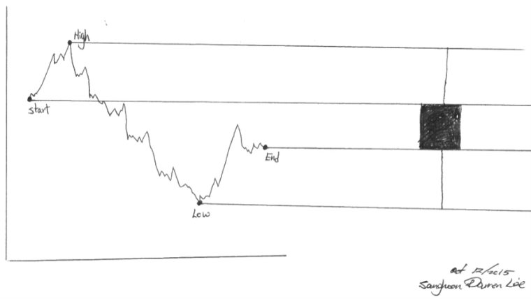
We have all had the experience of drawing line graphs. From temperatures to statistics, we use graphs. Why do humans like drawing graphs? People like to see pictures, summarizations and illustrations rather than writing. Most of the time, the pictures are easier to comprehend than long essays.
Investors follow stock movements in graph form to get a summary of the price action of a stock over a chosen time period. Of course price history in table form is available, but it is very rare to meet someone who prefers price history tables over simple graphs. History tables are frequently difficult to read, showing large amounts of data in very small text, turning an already difficult task for most people into a nearly impossible task. Many people use line graphs instead but some people prefer Japanese Candlesticks.
Typically, a candlestick pattern is viewed as a combination of the line chart and bar chart, representing four important pieces of information; the opening value, the closing value, the high price and the low price. Each candlestick represents a single trading day. The appearance of each candlestick can say many things that indicate different results for that particular day.
The candlesticks have two components: the body and shadows. A black or red body means the start price was higher than ending price or the price is declining. On the opposite side, a white or green body means the ending price is higher than the starting price or the price has increased. Shadows show the stock’s highest and lowest prices within the range that day. There are also unique indicators that can be useful in the candlestick pattern. A hanging man pattern has the body with no upper shadow and a long lower shadow which denotes a bearish pattern during an uptrend, which could be compared to an inverted black hammer, shown as a long upper shadow with no lower shadow (like an upsidedown hammer), which denotes a bottom reversal.
However, the candlestick pattern has one crucial weakness. By looking at the candlestick, we can learn how the price moved over the course of the day but we would not know how volatile the price movement was. Let’s say the price went from $8 to $15, 10 times in a day. Unlike the line graph, which could adequately display this rapid price movement throughout the day, the candlestick pattern is unable to accurately display volatility, only showing the cumulative effect of the price movement during the day.
Next time you are looking at stock charts, you may want to use Japanese Candlesticks charts instead of line graphs or bar graphs. Candlestick charts provide a variety of useful price summaries in an easy to use form and allow quick interpretation of stock information without delving too deeply into long data tables.
Sanghoon Darren Lee


